Pages

11.21.2013

Finding Inspiration

Wow was this a productive weekend! In addition to crossing some errands of my to do list, I ran a 5k and had time to whip up a few new things on my sewing machine. It all started as I was heading from errand to errand. I spotted an adorable antique and vintage store called By the Olde Garden Gate. I recklessly carefully cut across traffic to make the parking lot entrance. I could tell from the decor outside that it was a store I'd love. I was right.


Everything in the store spoke to me. From old typewriters, to vintage cameras, to driftwood wall hangers, to DIY burlap pumpkins, to vintage maps, to wooden shoe forms and decorative keys. I could have spent hours just browsing.


In the end I didn't leave with anything tangible, however I now possessed a TON of design inspiration: old maps in large glass vessels, rolled book pages tied with twine, wooden key hangers, decorating ideas. And a new DIY project. I fell in love with the burlap pumpkins. I only took one photo of a pumpkin fashioned out of an old coffee sack (where do you get these, by the way?!?). And I was on a mission to make my own. I found a blog with great instructions and headed to Michael's to pick up my materials.

After I made the first one, I was on a roll and made 2 more in less than an hour total. I still need to cut wooden stems for two of them, but I'm so happy with how this one came out. I picked up material from Jo Ann's, used some leftover burlap from Michael's for the leaves, and a champagne cork for the stem. I LOVE how it came out!


I couldn't stop after that and ended up making a pink & black buffalo plaid infinity scarf for myself and a matching bandana for Kylie. Here she is modeling the material before I got to work.


10.21.2013

White Kitchens, Subway Tile, Two-Toned Cabinets & Chalkboard Paint

I have noticed a trend in the kitchen photos I've pinned. My board is overwhelmingly white! White cabinets, white back splashes, touches of stainless steel and wood with a mix of modern & farmhouse details & little pops of color.


When we bought our house almost two years ago (cannot believe how fast it's gone by!) we loved the kitchen because it was renovated - a nice change from some of the super outdated kitchens we'd walked through during showings.  Our has granite counters, stainless appliances, tile floors, new cabinets - no hardware, but that should be arriving today! And we still love it, but part of me kinda wishes we could renovate it to look like one of these white kitchens of my dreams. But it doesn't really make sense to take on that project at this stage. It's a beautiful kitchen and making any changes to it won't add any value to the house when we're ready to sell.


But a girl can still dream a little, right? So while I wait for that project to make sense, here are some of the designs I'm completely drawn to. My dream kitchen is a combination of all of these.

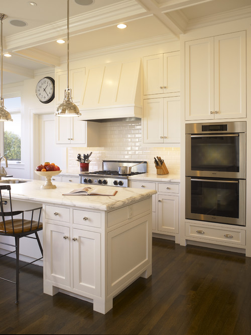
I love the bright, cleanliness of this kitchen. The countertops are awesome, white with little hints of gray, and the white subway tile backsplash.

Traditional Kitchen by South San Francisco General Contractors Dijeau Poage Construction

I really like how they chose a different color base for the island in this photo. I personally love a rich navy blue tone.

Originally spotted here

Or you could go two tone with white uppers and navy lowers, like this couple, featured in Apartment Therapy, did. This is one of my all-time favorite designs.

Found here

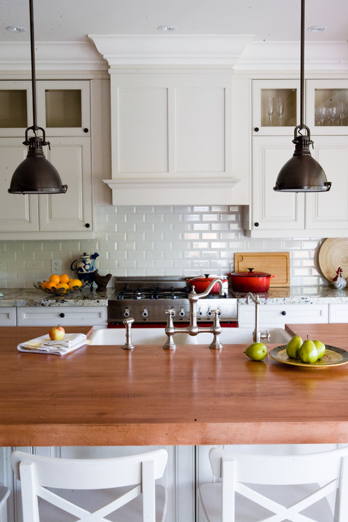
A butcher block island might be nice? I also like the glass front cabinets. Perfect for displaying beautiful decorative items.

Traditional Kitchen by Toronto Design-Build Firms Capoferro Design Build Group

This is a beautiful kitchen (and a drool-worthy home, if you have time for a tour)

Check out more pics

I'm still not over chalkboard walls. I think they're perfect for kitchens - grocery lists, weekly menus, etc. I have been debating one for a while in my kitchen, just haven't mustered up the courage yet. I think they look particularly great in white kitchens like this one.

Before & After on Design Sponge
This kitchen is so bright and air, thanks to the huge window above the sink. I like the cabinetry, clean simple lines, and the glass cabinets with grids. I also love the cup pulls. But my favorite thing in this kitchen are the wood and metal stools!


The next two kitchens are probably some of my favorites (and they're very similar). The first has the beautiful white cabinets and countertops, glass cabinets and open shelving, cup pulls, hardwood floors (I'm sick of the tile) and an island in a darker shade. 

Originally found here
And this one incorporates a lot of the same elements, but with the darker lower cabinets instead of an island. I'm loving those drawer pulls as well. How cute is that wood and metal shelf, would go great with those industrial stools. The lantern above the sink also caught my eye.


So what do you think? Do you like white kitchens, two-tone cabinets, subway tile? Thoughts on the chalkboard paint? Still in or should I give up on the idea?

10.17.2013

Vintage Kodak Camera


Scored this awesome vintage, 1950's Kodak Duaflex II camera yesterday while browsing a local antique shop. I was in search of some fun decorative accents to add to my home decor. I've totally slacked on the decorating (and blogging) lately. I only recently began the switch-over from sand and seashells to pumpkins and apple- and spice-scented candles, I know, I know I'm more than a little behind.

I've started classes toward my MBA, have been working A LOT and recently took on a freelance copywriting job...plus I've been away from home 4 of the last 6 weekends. So I've been a little tied up with other things. However, I'm getting back to my passion for decorating ASAP.

I even have a handful of projects in progress, so stay tuned...